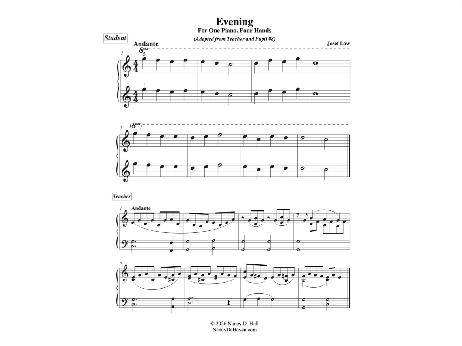
This is a duet for teacher and student written by Josef Löw entitled Am Abend (At Evening). It was originally written in the key of G major. I’ve transposed the first eight measures to every major key to give my students practice with sight reading and with key signature identification. This project started because one of my students will be tested in two months on all of the flat-key pentascales, and I wanted her to have some way to practice them other than mindless repetition. Please let me know how you use these, and if you find any typos, please do let me know so I can correct them!
The PDF can be downloaded by using the link below, but you can also find it via the menu under “Free Stuff”.
Download the PDF of this duet in all twelve major keys here.
Only one thing is impossible for God: To find any sense in any copyright law on the planet. Mark Twain
Post Format: Chat
Abbott: Strange as it may seem, they give ball players nowadays very peculiar names. Costello: Funny names? Abbott: Nicknames, nicknames. Now, on the St. Louis team we have Who’s on first, What’s on second, I Don’t Know is on third– Costello: That’s what I want to find out. I want you to tell me the…
This post has no title, but it still must link to the single post view somehow. This is typically done by placing the permalink on the post date.
Query loop “Title, Date & Excerpt” variation:
Block: Image
Welcome to image alignment! If you recognize this post, it is because these are blocks that have been converted from the classic Markup: Image Alignment post. The best way to demonstrate the ebb and flow of the various image positioning options is to nestle them snuggly among an ocean of words. Grab a paddle and…
Block: Button
Button blocks are not semantically buttons, but links inside a styled div. If you do not add a link, a link tag without an anchor will be used. Check to make sure that the text wraps correctly when the button has more than one line of text, and when it is extra long. Buttons have…
Block: Cover
The cover block lets you add text on top of images or videos. This blocktype has several alignment options, and you can also align or center the text inside the block. The background image can be fixed and you can change its opacity and add an overlay color. Make sure that the text wraps correctly…
Query loop “Image, Date & Title” variation:
Post Format: Quote
Post Format: Chat
Avatar block:
Post title block:
WP 6.1 Theme block category
Post excerpt:
This test post was generated using the block theme Emptytheme in WordPress 6.1.1. Navigation block with page list: Site logo: Site title: Tagline block: Query loop “Title & Date” variation: Query loop “Title & Excerpt” variation: Query loop “Title, Date & Excerpt” variation: Query loop “Image, Date & Title” variation: Avatar block: Post title block:…
Welcome to image alignment! If you recognize this post, it is because these are blocks that have been converted from the classic Markup: Image Alignment post. The best way to demonstrate the ebb and flow of the various image positioning options is to nestle them snuggly among an ocean of words. Grab a paddle and let’s get started. Be sure to try it in RTL mode. Left should stay left and right should stay right for both reading directions.
On the topic of alignment, it should be noted that users can choose from the options of None, Left, Right, and Center. If the theme has added support for align wide, images can also be wide and full width. Be sure to test this page in RTL mode.
In addition, they also get the options of the image dimensions 25%, 50%, 75%, 100% or a set width and height.
The image above happens to be centered.
The rest of this paragraph is filler for the sake of seeing the text wrap around the 150×150 image, which is left aligned.
As you can see the should be some space above, below, and to the right of the image. The text should not be creeping on the image. Creeping is just not right. Images need breathing room too. Let them speak like you words. Let them do their jobs without any hassle from the text. In about one more sentence here, we’ll see that the text moves from the right of the image down below the image in seamless transition. Again, letting the do it’s thang. Mission accomplished!
And now for a massively large image. It also has no alignment.
The image above, though 1200px wide, should not overflow the content area. It should remain contained with no visible disruption to the flow of content.
And now we’re going to shift things to the right align. Again, there should be plenty of room above, below, and to the left of the image. Just look at him there… Hey guy! Way to rock that right side. I don’t care what the left aligned image says, you look great. Don’t let anyone else tell you differently.
In just a bit here, you should see the text start to wrap below the right aligned image and settle in nicely. There should still be plenty of room and everything should be sitting pretty. Yeah… Just like that. It never felt so good to be right.
And just when you thought we were done, we’re going to do them all over again with captions!
The image above happens to be centered. The caption also has a link in it, just to see if it does anything funky.
Itty-bitty caption.
The rest of this paragraph is filler for the sake of seeing the text wrap around the 150×150 image, which is left aligned.
As you can see the should be some space above, below, and to the right of the image. The text should not be creeping on the image. Creeping is just not right. Images need breathing room too. Let them speak like you words. Let them do their jobs without any hassle from the text. In about one more sentence here, we’ll see that the text moves from the right of the image down below the image in seamless transition. Again, letting the do it’s thang. Mission accomplished!
And now for a massively large image. It also has no alignment.
Massive image comment for your eyeballs.
The image above, though 1200px wide, should not overflow the content area. It should remain contained with no visible disruption to the flow of content.
Feels good to be right all the time.
And now we’re going to shift things to the right align. Again, there should be plenty of room above, below, and to the left of the image. Just look at him there… Hey guy! Way to rock that right side. I don’t care what the left aligned image says, you look great. Don’t let anyone else tell you differently.
In just a bit here, you should see the text start to wrap below the right aligned image and settle in nicely. There should still be plenty of room and everything should be sitting pretty. Yeah… Just like that. It never felt so good to be right.
Imagine that we would find a use for the extra wide image! This image has the wide width alignment:
Can we go bigger? This image has the full width alignment:
And that’s a wrap, yo! You survived the tumultuous waters of alignment. Image alignment achievement unlocked! One last thing: The last item in this post’s content is a thumbnail floated right. Make sure any elements after the content are clearing properly.


One response to “WP 6.1 Theme block category”
This test post needs a comment.
Post comments form block: